Caroline Pastrano
← Back to projects

Capmetro Usability Study

A comprehensive usability study on the CapMetro public transportation app

Timeline

September – December 2024

People

5 UX students

Role

UX research

Outcomes

Full usability report

The Problem

CapMetro provides essential public transportation services for Austin and its surrounding areas. The CapMetro app is the only way for riders to access real-time route updates and purchase tickets ahead of time, yet is quite difficult for a first-time user to learn.

Our Solution

My team conducted a comprehensive usability study on the CapMetro app, including a heuristic evaluation, competitive analysis, and user testing, eventually producing a detailed list of recommendations to improve the user experience of the app.

I. Heuristic Evaluation

Our first steps were to conduct a heuristic evaluation and a competitive analysis so that we could figure out what to focus on for our user testing. One area that I focused on within the heuristic evaluation was the User Control and Freedom heuristic:
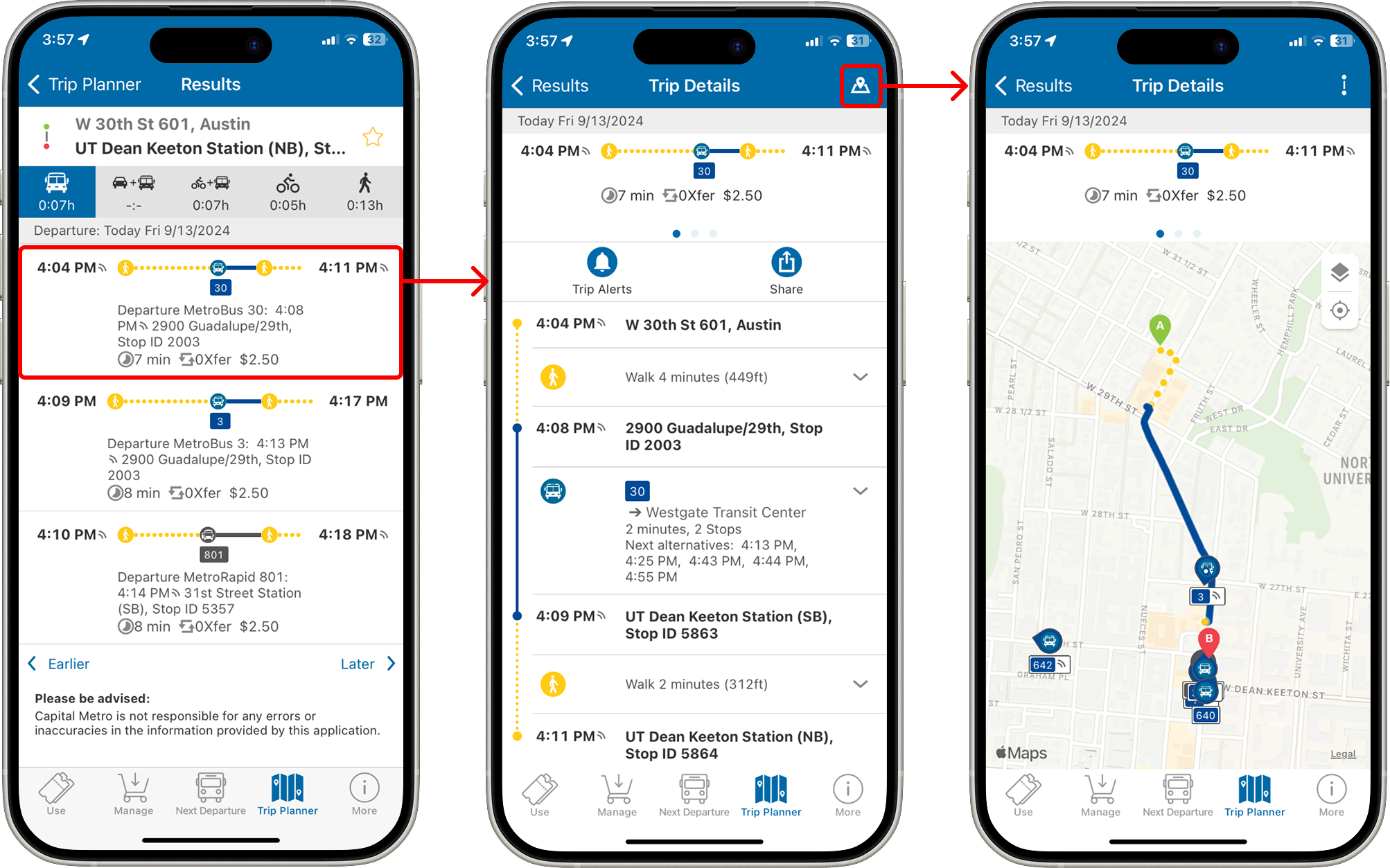
When searching for a route in the trip planner screen, the initial results view is cluttered with unnecessary information.

However, it is difficult to find an important feature like the trip map.

Here is one example of a usability problem I found in this area: when searching for a route using the Trip Planner tab, the initial results screen is cluttered with unnecessary information, while it is difficult to find something more relevant such as the trip map. My recommendation was then to collapse all the small text on the initial results screen and to display the map on the first “Trip Details” screen.

II. Competitive Analysis

We evaluated six competitors for our competitive analysis. For this, I focused on the DoorDash app, an indirect competitor to CapMetro as a food delivery app. Here is one recommendation I made for CapMetro based on the DoorDash app:

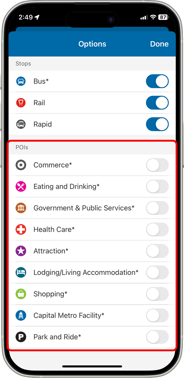
The CapMetro app has a feature showing Points of Interest that the user may want to explore, but this is hidden within an obscure options menu.

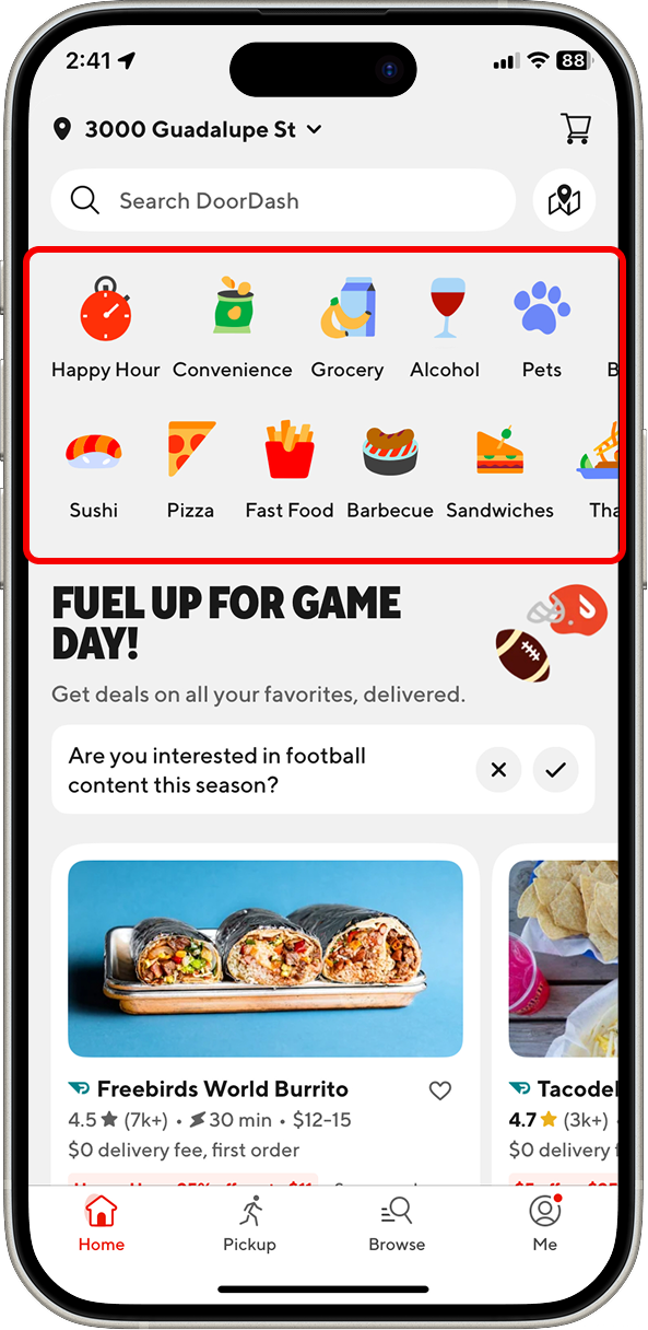
In contrast, the DoorDash app has large icons representing specific delivery categories for the user to browse. This menu is displayed prominently on the front page.

III. User Testing

We began our user testing process with a screener to find participants with a mix of experiences with both the CapMetro transit system in general and the CapMetro mobile app specifically.

We then conducted moderated user tests with the five participants we found. We began each session with a short interview to collect even more details about their experience with CapMetro, and then we had the users complete five tasks within the app that we had outlined ahead of time, utilizing a think-aloud process.

Once we had completed all testing sessions, we sat down and produced summaries of our findings for each task. Here is an example that I worked on:

Task 4: Finding a route to a specific location

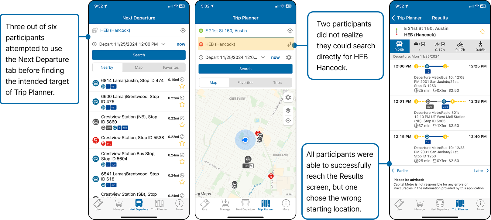
Goal: Users will locate the HEB Hancock location, and then identify a specific bus route that they can take to that location.

Results:

Insights:

  • Most users were able to completely the task successfully but only after making a few errors, which suggests that the app does not provide the user with a clear pathway to complete this task.
  • Many initially gravitated to the “Next Departure” tab, but this was the incorrect destination for this task.

Recommendations:

  • Consider consolidating Next Departure and Trip Planner, or make their functions distinct enough to differentiate quickly.
  • Make it more obvious that you can search for specific destinations as opposed to only bus stops.

IV. Final Report

We consolidated our findings from each of the previous steps into a final report of all insights and recommendations. A summary of our findings:


Some essential functions feel “hidden” in the app, such as map view and bus stop walking directions.

Rearrange information hierarchy so that most important features are displayed first or most prominently. Also consider creating a short onboarding tutorial for new users.


The ticket-purchasing flow is lengthy and confusing to navigate.

Simplify the ticket-purchasing experience by having all prices and ticket options listed on one screen.


Different functions within the app are difficult to distinguish, e.g. "Next Departure" and "Trip Planner."

Consider combining similar functions and using clearer verbiage in order to reduce confusion.


There are multiple different ways to complete tasks, resulting in unnecessary clutter and confusion regarding what pathway to take.

Create clear, simple pathways for each major task within the app.


See the full final report here!